iOS Layout Management Using UIStackView
The UIStackView is one of iOS development's most powerful layout tools, designed to organize views in either horizontal or vertical arrangements. This component significantly reduces the complexity of Auto Layout code while providing dynamic constraint management when views are added, removed, or modified.
By default, stack views position their arranged subviews horizontally. Throughout this guide, we'll focus on horizontal arrangements, though the same principles apply to vertical stack views by setting the axis property to .vertical.
Managing Arranged Subviews
Stack views provide an intuitive API for managing their contained views:
stackView.addArrangedSubview(view: view)
stackView.insertArrangedSubview(view: view, at: 1)
stackView.removeArrangedSubview(view: view)
A crucial detail: removing an arranged subview doesn't eliminate it from the view hierarchy entirely. To completely remove a view, call removeFromSuperview() on the subview itself.
One of the most compelling features of stack views is their automatic constraint handling. When views are added, hidden, inserted, or removed, the stack view manages all constraint updates automatically. This makes animations remarkably simple:
UIView.animate(withDuration: 0.3) { [self] in
    arrangedSubview.isHidden.toggle()
}
Even changing the stack view's axis can be animated smoothly:
UIView.animate(withDuration: 0.3) { [self] in
    stackView.axis = .vertical
}
Understanding Distribution Behavior
The distribution property controls how a stack view adjusts its arranged subviews to fill available space or expand along its axis. The available options include:
fillfillEquallyfillProportionallyequalSpacingequalCentering
To demonstrate these behaviors, consider a horizontal stack view containing label subviews. When the stack view's leading edge is constrained but the trailing edge remains free, content can expand horizontally.

With labels of similar length, the distributions appear quite similar. However, when one label becomes significantly longer, the differences become apparent:

In this scenario, fillEqually and equalCentering expand considerably, while other distributions maintain more conservative sizing.
The fill, fillProportionally, and equalSpacing options allow labels to grow according to their intrinsic content size. Meanwhile, fillEqually maintains uniform width across all arranged subviews, forcing shorter labels to expand when longer labels are present.
The equalCentering distribution attempts to center each arranged subview equally within the stack view's width, which can produce unexpected results when content sizes vary significantly.
When both edges of the stack view are constrained, forcing it to stretch, the distribution differences become more pronounced:

The fill option stretches labels based on their content hugging priorities. fillEqually maintains uniform width while truncating longer content. fillProportionally distributes space proportionally based on content length. equalSpacing maintains consistent spacing between labels, while equalCentering keeps equal distances between label centers.
Handling Compression and Expansion
When a stack view faces constraints on both edges, it must either compress or expand its arranged subviews. The stack view's distribution property, combined with compression resistance and content hugging priorities, determines the final layout behavior.

Compression Resistance Priorities
Compression resistance defines how subviews behave under compression. When stack views are constrained in a way that compresses labels:

The fill, equalSpacing, and equalCentering distributions compress labels according to their compression resistance priorities. When priorities are equal, the stack view typically compresses the last label. However, fillEqually ignores compression resistance in favor of equal distribution, while fillProportionally focuses on proportional distribution.
To prevent specific labels from being compressed, increase their compression resistance priority:
label.setContentCompressionResistancePriority(.init(999), for: .horizontal)
Interestingly, even fillProportionally respects compression resistance settings, despite Apple's documentation not explicitly mentioning this behavior.
Content Hugging Behavior
Content hugging priority represents the opposite of compression resistance. It defines how much a view resists being stretched and prefers to maintain its intrinsic content size. When stack views are constrained to widths larger than their content requires:

All fill-oriented distributions stretch the labels to fill available space. To make a specific label maintain its intrinsic size, increase its content hugging priority:
label.setContentHuggingPriority(.init(999), for: .horizontal)
Both fill and fillProportionally now respect the label's preference to maintain its natural size.
Alignment Configuration
The alignment property determines how subviews are arranged perpendicular to the stack view's axis. The options are largely self-explanatory when compared to the default fill behavior:

The top and bottom alignments position the stack at the respective edges of the constrained height rather than filling the entire space. For vertical stack views, leading, center, and trailing work similarly.
Two specialized options, firstBaseline and lastBaseline, are particularly useful for text alignment. These become more obvious when labels have different fonts and line counts:

The firstBaseline option aligns text along the first line regardless of font size, while lastBaseline aligns along the last line.
Spacing and Margins
For filling stack views like fill, fillEqually, and fillProportionally, setting spacing between arranged subviews is straightforward:
stackView.spacing = 10
stackView.setCustomSpacing(5, after: subview)
Stack views constrain themselves to their bounds by default. To add margins, enable layout margins and configure them:
stackView.isLayoutMarginsRelativeArrangement = true
stackView.directionalLayoutMargins = .init(top: 40, leading: 40, bottom: 40, trailing: 40)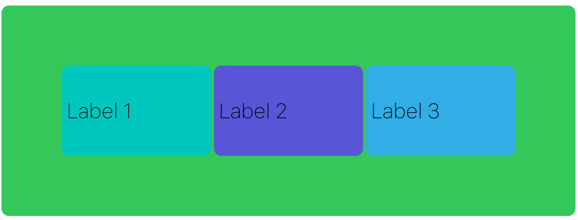
Adding Background Views
Stack views are layout helpers rather than visual components, so setting their background color has no effect. To add a background, create a separate view and constrain it to all edges:
let backgroundView = UIView()
backgroundView.translatesAutoresizingMaskIntoConstraints = false
backgroundView.backgroundColor = .systemGreen
backgroundView.layer.cornerRadius = 5
stackView.addSubview(backgroundView)

backgroundView.topAnchor.constraint(equalTo: stackView.topAnchor).isActive = true
backgroundView.leadingAnchor.constraint(equalTo: stackView.leadingAnchor).isActive = true
backgroundView.trailingAnchor.constraint(equalTo: stackView.trailingAnchor).isActive = true
backgroundView.bottomAnchor.constraint(equalTo: stackView.bottomAnchor).isActive = true
Summary
UIStackView excels at most layout scenarios, particularly those requiring vertical and horizontal alignment. It dramatically reduces the code needed for complex layouts while providing automatic constraint management when modifying arranged subviews. Understanding distribution types, compression resistance, content hugging priorities, and alignment options enables developers to create sophisticated, responsive layouts with minimal code complexity.